
Studio Happenings 2006 Jan-Apr
Other Studio Pages:
2004 (Aug-Dec) | 2005 (Jan-May) | 2005 (May-Aug| 2005 (Aug-Dec) | 2006 (Jan-Apr) | 2006 (May-Dec) | 2007 (Jan-Aug) | 2007 (Aug-Dec) | 2008 | 2009 | 2010 | 2011-2012 | 2013 | 2014-16 | 2017 | 2018 | 2019 | 2020
Click on images below to ENLARGE
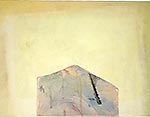
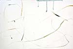
Finished Pillars of Hercules, the 20 x 16 pencil and gesso on paper. Livened it up, basically, and thought of the title when I looked at the two dark verticals in the upper left. It's "poetic" rather than declarative. Doing more of these (e.g. Mt. Ste. Victoire) recently than in the past 10 years. Don't know why, but I do enjoy the improvisation.
1/6/2006
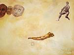
Worked on Nearly Simultaneous (11/2). Moved the frame so that the composition doesn't do a rocking chair. Now the female is the central figure, and I like the pose of wisdom sleeping. Right now the flesh tone is too dull. Hard to make a lively yet serene female without doing Renaissance porn.
Came across an older painting, Tectonics, and really liked the section at the bottom for its contained effusiveness. It's inside me now; I don't know where it will come out.
1/9/2006
Twenty-three years, and it finally happened. In 1983, I responded to the challenge for professors to become "computer literate," only to discover as a bonus that the thing could make colors and shapes. Oh, it was a bit of a problem, since at that time you had to learn a computer language to do it, but still! I thought the computer would be a fast way to do quick color sketches or to try revisions when some color or shape wasn't working in a painting. It was very aggravating, then, when the graphics capabilities of the computer were so constraining. Eight "colors," an orange, green, purple, blue, black , and two whites, were a pretty limited palate.
As I pictured what to do with the main field in Nearly Simultaneous (1/2/2006), I realized that I could USE THE COMPUTER! The final irony is that, after trying hundreds of colors as modifying washes, none of them worked as well as a subtle wash of the predominant hues already there! At least I didn't waste my time in the studio by finiding this out the slow way.
Now the ground lets the figures stand out, while conveying the biosphere they inhabit.
1/11/06
Got the expression on the upper right figure in Nearly Simultaneous. Rather than try stuff out in sketchbook, decided that having the rest of the painting surrounding me and the figure would inspire the "right" expression. The consequent accidental "early Greek stare" lead to the current look, which is somewhat Mona Lisa.
1/13
Again, scale bites! The study for T looked great. Having solved the surface problem by keeping it pure white after all, I sketched in the lower right geometric T-like shape and the tree with the same proportions as in the study. It just didn't look right. What was really a pain was that I had to sketch on the pristine surface, then erase if it didn't turn out. It didn't the first several times. Now, the relationships between distances and objects look right, and, by using several different techniques, I've managed to get the canvas surface back to its pristine, Robert Irwin, state.
1/23
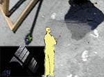
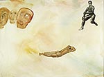
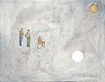
The nude in Nearly Simultaneous is building character as I paint, with no spectacular changes. She is right in spots, so far just her rear, far calf, and hair; the rest will come. Not so for the three old faces. I was painting them up close, worrying about color relationships and basic face structure. When I stepped back, they had become nasty-looking. My first impulse was to soften them back up, into gazers, but I closed up the studio, to let them cook 'til next time. Something radical might be trying to come through, or they might have been an accidental accident.
Made a scan and a photo I'm interested in:
1/25
The accidental mean faces are a mistake-accident, not a good accident. The dark greens and browns do, however, make a good sub layer for the impasto grays, ochres, etc. which will give the faces an aged stone look. The million-mile-staring eyes have to come back in the near figure, as do the squint-thinking eyes in the end figure. Also took out the necks because it places them in time. Matching the free-flowing washes that surround the whited-out necks (and female figure corrections) will be interesting.
Irving Sandler, in A Sweeper-Up After Artists, recounts heated arguments in The Club over whether there are accidents or not. Some artists think as I do that accidents may improve the direction of a piece but bad accidents have to be fixed, while the earlier New York School artists argued that everything should be put down with authenticity, there being no accidents.
1/30
Nearly Simultaneous is getting loose, like a race car gets loose. I think this one might not be able to be driven "on the edge." I'll have to be happy to finish well and without a crash. Newman, I think, replied to the question of which painting was his best with "the last one." Not true for me. Some are stunners, others I know are good, but don't have the frisson of better ones.
Nearly Simultaneous's male figure blends in more, now that I've put a satin matte glaze on everything, but the female figure needs more mystery and life, the repairing of the main field is taking away some of the flow, and, although one face is starting to look okay, neither it nor anything else excites me as much as wanting to get to "T," with its competing tree and geometric images in timeless dialog.
2/1
Moved ancient heads, got a better look on one, a look of squinting rather than scowling. Re-did the woman. Closer. She glows a bit, but has no life, even with the brushier technique. Must look and think more. Think and look?
2/3
Woman is getting there, a glow and vivacity beginning to emanate. As Nearly Simultaneous approaches its finish, Final varnishes come into play, a dry feeling for the ancient faces, different reflectivities for the bodies, hair, and color field.
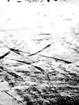
The scan of tire tracks in the snow will probably be the basic for the 24 x 36 in. canvas I just stretched. Empty, gestural, ordered, chaotic, and a composition that moves in a different way.
2/4
today:
![]()
2/10
Nearly Simultaneous was seen by the director of a small museum last night. I was so glad to hear him say that, like other of my works, the piece had staying power. Each time a person comes back to it, there's more to discover about what's there and the viewer's relationship to that and to himself. Although the faces of the old ones didn't bother him, they still bothered me this morning. They, and the hair on the woman's left shoulder need fixing. Only one person to whom I've showed the piece thought the shoulder was off; and no one was bothered by the faces. So, my original unhappinesses were not added to. Nearly Simultaneous is almost-finished.
2/13
Finished by cleaning up some of the female figure and aging, yet humanizing, the peering masks. The masks vary from sensual and war-like to stunned to wise and accepting, looking forward while knowing we are looking back.
2/15
Trying out stuff. I need a major section of the next painting to be richly-wokred pencil, reflecting light yet showing the texture of the canvas. So far have experimented with 4B pencil with: fixitif alone, fixitif covered with varnish, varnish alone, and all of these re-worked a second time. As usual, an accident is opening new doors. One of the trials worked perfectly, but the imperfect varnish-alone creates a ghosting effect, which might take the idea into a new realm.
2/17
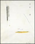
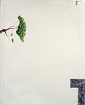
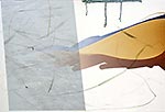
Went to work on T. Destroyed the first concept of having two opacities of gesso when the piece seemed to call for more sensuality--perhaps because of the ghosting effect of one of the pencil experiments. Used spatulas and titanium white. I feel I understood both Pollock and Irwin as I did this. One of the best things I've done for its harmonies and contrasts. It will, understandably, be considered an "interesting background." Having de-rationalized the background, I then re-rationalized the geometric, partial "T" shape. Giving up the ghosting, I like the sharper edges and the harsher pencil marks. Somewhere during all this, I recalled a palette fragment that I'd saved because it looked like a partial frame or shape. This fragment is now in the upper right.
Still have to paint the washed-in tree, and may work some more on the "T," to get the harsh strokes and velvety graphite to play off each other.
Started a 30x40 in piece called Triumvirate, because of the three drips from the top stroke. The painting began because I wanted to make a green and ochre stroke, and see where it would lead. When the topmost blue stroke began to drip, I spent many minutes rotating and tipping the work and adding water to get the drips right. The hesitant jumping at the end of the drips is great. Another art technique secret.
2/20
T got worked over. "Remember, Man, thou art dust and into dust thou shalt return." LOTS of charcoal dust (had to experiment to get the right density) wiped on, wiped around, ground in, chamoied off. The previous Irwin-like subtlety of all white, incised and impastoed was too distancing. I think the new surface works better; when I walk in to studio again, fresh, I will see. Also worked on the "T" shape itself, grinding, using the stump, rubbing. It's getting there. The previous "fresh' look that I thought was an improvement on the study was not. Needs to be an imperfect try at perfection.
Sipping coffee and staring at Triumvirate, I decided the top stoke/drip was too important (and too new) a thing to lose. As I ran through images in my mind, the left side strokes reminded me of the car tracks in snow I'd liked a week or so ago. Decided to go home and use the computer to do a study. (Full circle from when I first started to use the computer and found out it was terrible for during a study for a painting!) The result, while too stiff (especially the dune shape and surrounding strokes) will serve as a starting point. Luckily I know how to intensify the three-drip stroke while keeing it spontaneous.
2/22
T now too "dirty"-lookng, not pure enough, so massaged it with white. Think this works well, the effort/expression/chaos of the worked surface still there, but not so obvious--pristine yet sensual. Now, just have to finish the tree, which I just realized looks like a tree from Rome. I think this is an accident.
![]() T too "dirty"
T too "dirty"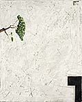 T just right
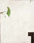
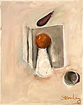
Also worked over the pastel still life I'd been doing while conducting the Souther Shore Open Studio with white paint, more pastel, more white paint, etc. Think it's finished; will know next time I see it. The lure was to "eraae: most of the pastel, to see what the empty space would say. Ended up with isolated voluptuosness, translucency, twistiness, and shadow.
Experimented with transferring computer image to canvas, with and without laying down medium first. Looks like this will work, even without the Inkaid I've ordered, but will wait to make that final experiment before I lay the snow tracks into Triumvirate. Did darken its stroke and drips.
2/24
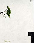
Finished Pear and Objects by touching up a few over- and under-defined areas, experimenting with fixitif and varnish combinations. Although the green bottle glows a bit less, it was the price I had to pay for the pear's being sensuous and ethereal simultaneously. I am excited by this piece. New relationships? Colors? Composition? Have to keep it in sight to inspire other work.
2/25
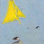
The Chesterton Art Center wanted 4 x 4 in. prints for a fund-raising book. Created Shores Near and Far from painting Offshore. The mood has become more dynamic and spatial in this work (active swimmer, transparent sail, reflective/shadow shell), rather than quiet and contemplative as in the painting. The print, done digitally has digital-only esthetics in the field texture, color saturation, and trasparency, but I don't think it looks typically "computer."
2/27
The dune just didn't do it in Triumvirate, so I decided to paint in my last dog, Jesse, as he looked back at me. (His picture was in snow, as are the tracks I'm going to use, the road we were on was a dune road, it just seems right.) Didn't want all that snow, besides, the car tracks will not be clearly in snow, if all works according to plan (when will that Inkaid get here, so I can experiment?). This changed the feel of the painting, so I'm now calling it Transits.
![]()
Also put together a sculpture that wanted to come together when I walked into the studio. These aluminum castings had been casting about for a solution for 30 years. The final resolution was barely different from one of the earliest tries, the main difference being in a slight elevation from the base. Casting about, also, for a name. Two things same yet different, not exactly yin-yang. "Dyad" too somethingy; Correspondents seemed more human, and also sounds like the heart of the piece, correspondence.
3/1
Materials came yesterday for experiment affixing pigmented ink images from computer to canvas. Was going to try them out, but deadlines for brochure for The Depot Museum & Art Gallery and for brochure and a newsletter for Southern Shore Art Assoc. have rolled up on me. I don't really mind this, having to just make something look good.
3/4
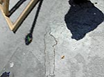
 Having missed my regular studio time Friday; I felt like working on a computer art piece at home today. Pulling up resources of interest, I didn't know where I was going until I pulled up the shadows and lower corner of a catapult. The two main shadows, the dynamism of the pendulum-like shadow, the out of vision-field, and who knows what else told me that here was the essence of what I had been dimly sensing in the other pieces. Spent a few hours scaling, moving, tranparentizing parts to get where I am now. The lower left rectangle is the biggest problem, with its diagonal (but I like the blinds and shadowed interior idea). The rectangle has to go, but, if I use the diagonal of the window, how do I make it work with the pendulum-catapult diagonal? Also, the elements are just too collage-like now, needing more unity and more depth.
3/7
Finished T. The addition of the acrylic right-angle piece at the top right was a good idea. It wokrs compositionally and mirrors the "T" below, minus the clean geometry. It is the only real thing in the piece, besides the viewer's and my thoughts. I had to bend a palette scrap to get it. Overall, I think the painting is very beautiful, as are the real objects it refers to, nature and human thought.
3/20
Back from vacation. I'm anxious to experiment with overlaying sketches of three areas with photos I took later. Sketches were of lovely syncopated rhythm of 5 palm trees, a jagged lava arch over calm water, and a large split rock with stressed or flowing rock patterns within.
Also took photos of artistic interest. Don't know how they will emerge from my "Art Resources" folder.
3/22
Since the last work turned out so well, I again went down the hall to the open studio and started a pastel of the still life, to be painted into later. This one gave off some menace. Some subtle sexual aspects emerged: a styrofoam cup and an orange of all things! Later, as I painted into it, it got almost delicate. Where all this comes out, I've no idea. But, once again I like the pastel/real to paint/art experiment.
3/24
Spent the entire time working on the tracks (on the computer) and their scale/relationship to other parts of the painting. Had brought the painting from the studio, planning to print and transfer the tracks that I'd prepared earlier. When I looked at the tracks image, however, it now didn't seem right. First I worked on making the photo of the tracks look more "real." Then had to soften parts, to blend in with the painting. Then rescaled to fit in better with strokes already on the painting. Then decided not to place it as worked out in the study, but to let the tracks be wider, to overlap the visual plumb line from the drips, and to let the top, vaguely distant part of the image merge into the drips. Then decided that verticality would work better than the angle, giving a calmer, classical feel to the painting, the dynamics having to be teased out by the viewers' deep looking and referencing their own experiences.
By the time I divide the image into fourths that the printer can output, and start transferring the four, the idea for the work might change some more.
3/29
Busy writing grants and doing newsletter for arts group. Have done some sketching. I like the one of separated chairs, whose composition removes it from the trite I hope. Also finished "Potency," which is potent with sexual connotations and with emptiness. Many viewers seem to think the emptiness of my pieces is sad. Actually, it is my delight in realizing that, like an opened door, possibilities exist in emptiness.
3/31
As often happens with an exploration, the first steps are trite. The three overlays I did of sketches and photos from Hawaii are bland and/or decorative. Now that they've been done, they will simmer, to emerge better next go-round.
Syncopation 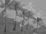 Arches
 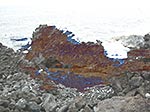 History
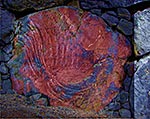
4/2
Stretched and gessoed 36 x 48, scribbled back into upper right, empahzised patch on upper left, reinforced stains lower right. Think the stains will go. Miss the wrinkles being totally gone. Will take a hard look at whole thing before I leave studio, then forget about it until I next see it. Something might come.
Went back to "Three or More Relationships" from last year. The thing was just too weak. More glazes necessary.
4/7
Screwed up "Three or More Relationships." Got the right things to pop, but the surface is DEAD. May be able to liven it up with further glazes and lift-outs.
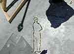
Something is clicking with the newly-gessoed canvas. After second gessoeing, the scribbles are more subdued. Than I hung an old print, "Propel Her," and noticed something in approximately the same spot that, altered, would be perfect. Mystery cuts topped with a circle (moon?). I was wondering about using a dark bkgrnd, as in the woodcut, when I came across Millares' "Dibujo." Somehow that spirit and my images are going to come together. I will use for the figure, instead of the laid back contemplator in "Propel Her," a foreshortened sketch I made this summer.
Propel her woodcut.........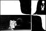 Man foreshortened sketch...
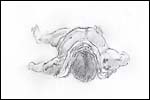
Have abandoned the drawing/photo overlays based on Hawaii. After hours more work, there was only one small area that was at all significant.
4/14
The experiment on for "Three or More Relationships" for possible use on the new piece based on "Propel Her" and the foreshortened figure (calling it "Discourse") did not work. It will work as a starting point for "Discourse."
Meanwhile, "Three or More Relationships" has gone through several more stages. Getting there.
Also tentatively finished "Catapult," a computer piece. Hell of a time getting transparencies and values to work as a statement and compositionally. The visual and metaphorical multi-layering work well on this, reflecting a darker mood, but not one that escapes Zen.
4/17
Finished the reworking of "Three or More Relationships," calling it "Three Or." The moon is playing a bigger part in paintings now. First this one, and then the one I'm now working on. Maybe it is just that it "contains" the extremely ancient and the light that gives life to earth. Anyhow, this one now has the balance esthetically and in content that I want.
Spent the evening finishing Catapault. Like a composer conducting his own piece, tonalities shifted, dissonances were brought out, then made more subtle, statements brought forward. All in all, I like this piece. It has many surprises and quiet joys for being so initially blatant.
4/19
It has become much more time consuming to put the computer image of tracks onto part of Transits than it would have been to simply paint them. Mock up images of painting and tracks as studies.
![]() Scale. Transparentize. Put special sizing on canvas. Print in four sections since printer is limited. For authenticity however, it is important that part of the canvas have a passing moment immortalized.
Scale. Transparentize. Put special sizing on canvas. Print in four sections since printer is limited. For authenticity however, it is important that part of the canvas have a passing moment immortalized.
4/21
Disaster. In trying to transfer pigmented ink tracks to Transits, one printer setting after another failed, clogged nozzles would not clear, and there were problems with using the transfer paper with the back up printer. The hot iron idea was certainly a poor one. Full wastebasket, one painting with goop on it. So bad I'm actually looking forward to filling out a 501 (c)(3) application for an arts group this afternoon.
4/25
Had decided to go dark on the piece with the "Propel Her" and Millares influences. For some reason, felt rotten today, and wasn't going in to the studio. Then I thought, why not let my darkness influence the dark field/ground in the piece? So, I went in and put the second layer on what I'll call "Nocturne." Didn't surprise me very much, and there are still coats to go, but some of the dark "ssssssss's" and red emergences are interesting.
![]()
![]()
![]()
![]()
![]() Previous
Previous ![]() Top
Top ![]() Next
Next
pencil and gesso on paper, 20 x 16 in
acrylic [in progress],36x40 in
detail
acrylic,36x40 in
in progress acrylic,36x30 in
in progress acrylic,30x40 in
in progress 2 acrylic,30x40 in
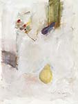
acrylic & pastel on paper 24 x 18 in
computer (size varies)
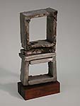
cast aluminum16 x 7 x 3 in.
acrylic and pencil on canvas 36 x 30 in.
pastel & acrylic on paper 24 x 18 in.
archival computer print 12 x 16 in.
acrylic 24 x 30 in. in.
archival computer print 12 x 16 "

stage 2 acrylic 36 x 48"